Profits, Payouts and Equity Prices, Part 1

TLDR: The value of corporate equity relative to GDP is at a historical high. But this does not necessarily mean there’s a bubble: profits and shareholder payouts are also very high relative to historical values.

I first started thinking about economics thirty years ago, during the (first) tech boom. 

This was the era of “irrational exuberance,” the phrase coined by the recently deceased Alan Greenspan and made famous by Robert Shiller. I wrote a review of Shiller’s book of that title for In These Times — one of my first published articles.  My first paper in graduate school was a replication of a paper by Brad DeLong and Larry Summers1, which argued that seemingly excessive stock valuations could be explained by rational investors extrapolating recent earnings growth into the future. 

All of which is seeming at least a little bit relevant today.

Between the start of 1995 and the end of 1999, the price-earnings ratio for the S&P 500, as measured by Shiller, more than doubled, from 20 to nearly 44. Then over the next three years, it fell back nearly as far. Today, price-earnings ratios by the same metric are just shy of 40, not far from the peak of the first tech boom. Everything old is new again, it seems. (Except that, as Paul Krugman notes, people generally liked the products of the first internet companies.) So the obvious question is whether this is also a bubble — whether the second half of the late-1990s story will get a rerun as well.

There are many people out there with highly specialized expertise whose whole job is to think about stock valuations. I am not one of those people! If you are looking for investment advice, you have come to the wrong blog.

But I do think I have something to add.

Most of what makes financial-analyst jobs hard has to do with specific companies and specific markets. Things get easier when we are looking at the stock market as a whole. (And that is where my own background in heterodox macro is more likely to help.) When we are talking about corporate equity in the aggregate, rather than individual securities, some arithmetic comes into play that helpfully limits the space of possibilities.

One way to think of a share is that it gives a claim on future payments by the corporation that issued it. This is not all that a share is — as Arjun and I stress in Against Money, it’s important to keep sight of financial assets’ existence as concrete objects with their own specific properties, and not reduce them to simply a future cashflow. But certainly the cashflow it gives claim to is one very important property of a share.

Again, the value of share is not reducible to present value of expected (in either the statistical and/or psychological sense) future payments. But those should act as an anchor. Unless we have good reason to think there is a change on value market participants put on future payments, we should expect share prices to vary roughly in proportion to them. And even if we think valuation of shares can vary indefinitely with respect to payments they give claim to, it’s worth knowing how much of current share prices would have to be explained in these terms, and how much can be explained by variation in the payments. 

In the rest of this post, I am going to look at the US nonfinancial corporate sector. This means excluding the 20-25% of corporate equity issued by financial businesses, and including closely-held corporations as well as those listed on public exchanges. This is mainly because that’s the universe for which it’s easiest to get consistent data. But I also think it’s a reasonable thing to be interested in substantively.

*

If we look at nonfinancial corporate equity over the 80 years since World War II, here is what we see:

The figure shows the total value of nonfinancial corporate equity,as a share of potential GDP. (I am skeptical of potential as a measure of actual economic potential, but here it is just functioning as a trend, to smooth out short-term changes in the denominator.) This, I would argue, is the most straightforward measure of the value of the stock market in broad social terms — how much claim wealth in this form gives on social labor and its products.  This is also, of course, the metric used by Piketty. 

As the figure shows, stock market value in that sense has had three long upswings. The first peaked in the late 1960s at 0.9, the second in 2000 at 1.6, and the third is ongoing, with the ratio currently at 2.3. (The data in this post is drawn from the Fed’s Financial Accounts, and goes through the first quarter of 2026.) Over the long run, there is a clear upward trend, especially over the past 15 years. (The dotted line shows the post-WWII average.) By this metric, the current stock market boom has now run well ahead of the late 1990s one.

How should we think about this?

Logically, the value of corporate equity relative to GDP must reflect a combination of four factors: value added in the corporate sector as a share of GDP; corporate profits as a share of their value added; payouts to shareholders as a percentage of profits; and the value placed by markets on each dollar of payouts. 

In other words, if corporate stock is worth more relative to GDP, that can be either because more of GDP is now happening in the corporate sector; or because more of the income from that activity is going to profits; or because more of those profits are being paid out to shareholders (rather than retained in the firm); or because financial markets place a greater value on each dollar of payment. Or of course some combination of those.

We can write this as an accounting identity:

equity/GDP = value added/GDP * profits/value added * payouts/profits * equity/payouts

As with any accounting identity applied historically, it is useful insofar as it corresponds to (1) categories in the relevant data, and (2) distinct causal factors we believe to be at work.

For the first term, we are, again, using all nonfinancial corporate equity, which includes closely held as well as publicly-traded corporations, and the BEA’s estimate of potential GDP. (Both are in current dollars.) Value added is defined, as usual, as sales less the cost of non-labor outputs. Profits are after tax (and of course also after depreciation); conceptually, these are the funds potentially available for distribution to shareholders.2

Payouts I am defining as dividends less net new equity issues. That share repurchases are conceptually equivalent to dividends is not, I think, too controversial at this point (though it creates a lot of headaches). We are also adding shares retired through cash acquisitions, and subtracting shares issued whether in IPOs or otherwise. This might seem odd at the level of an individual firm, but at the aggregate level these other flows seem clearly equivalent to buybacks and dividends. If firm A buys up all the shares in firm B for cash, that is a payment from the corporate sector to shareholders, just as if firm A were buying back its own shares. Similarly, new shares issued are a reduction in the aggregate payments from the corporate sector to shareholders just as a reduction in dividend payments would be.

It might sound strange to define IPOs (which  generally are quite exciting for stock market participants) as equivalent to dividend reductions (which generally are not.) But this is where the aggregate perspective matters. Shareholders as a whole already own all the equity of the corporate sector as a whole. An IPO is a payment from shareholders to the corporate sector, exactly like buyback is a payment from the corporate sector to shareholders, without in either case any change in aggregate ownership rights. Or looking at it from another point of view, new corporations are in general competing with existing firms;  the profits flowing out to shareholders of the new firm are to a first approximation deductions from the profits flowing to claimants on existing firms. Nice for the shareholders in the new firm, if it succeeds; but no use to shareholders as a class.

Finally, the valuation term asks, in effect, what is the market price of a dollar of income from the corporate sector. It’s analogous to the price-earnings or price-dividend ratios one sees at the level of individual corporations or indexes, though not identical given the nonstandard (but, I would argue, appropriate) way I have defined payouts. Here it also functions as the residual term, reflecting any change in the value of equity not explained by the other factors.

The figures below show the values of each of these terms over the past 80 years. What do we see?

We will start with the first term, corporate value added as a share of GDP. This shows how much of economic activity takes place in the corporate sector, and is potentially available for shareholders.

As it turns out, the corporate value added term does not do anything interesting. Yes, it is modestly lower (around 50 percent) after 2000 than its average in the earlier decades (53 percent), suggesting that all else equal, we might expect the value of corporate equity to be slightly lower relative to GDP in the 21st than in the 20th century. But this change is very small compared with the movements in the other terms. This factor might be important if we were comparing the US to other countries, but it is not part of the story here.

Next, profits:

Profits as a share of value added shows much more variation, falling by half in the 1980s, then rising in this century, in two big jumps — one after 2000 and the second over the past five or so years. While the corporate share of GDP doesn’t vary by even 10 percent over the whole period, profits as a share of value added are fully three times greater today than they were for much of the 1980s. 

The third term is payouts.

Payouts (as I’ve defined them) also show large variation, rising from a bit under 40 percent of profits in the early decades to over 80 percent in more recent ones. The timing here is a bit different — though there is plenty of short-term variation, the long-run shift happens in a single big jump in the early 1980s. (This was the topic of an essay in my dissertation, which I never managed to publish as an academic article but did turn into a report for the Roosevelt Institute.) This term gets relatively little attention in discussion of stock prices, but it seems to me that it is as fundamental as profits to any discussion of long-term trends in the value of corporate equity.

Finally, the valuation term shows a lot of short- and medium-term variation but, perhaps surprisingly, no long run trend. Today’s ratio of around 40 is close to what we see in the 1950s and 1960s.

Again, what we are measuring with this last term is the ratio of equity value to shareholder payouts, including net share repurchases. The big spikes in the early 1970s and in 2000 are because those years saw exceptionally high new equity issues, which means very low payouts by my metric, and therefore very high ratios of equity value to payouts.

It is more common to talk about equity in relation to earnings, on the implicit assumption that profits are of equal value to shareholders whether they are paid out or not. I’ve shown this latter ratio below. But personally, I do not think that that is a good assumption. Shareholders evidently care a great deal about payouts — why else would companies pay dividends and make share repurchases? I think it is important to distinguish between corporations and the shareholders who exercise claims on them — the former are not simply the personal property of the latter. From this point of view, it is more natural to talk about valuation in terms of the price shareholders place on the income they actually get from corporations, as opposed to the underlying profits.

All of these series (except the last one) are combined in the next figure, which is really the whole point of this post. If you take one thing from one I’ve written here, this picture is it.

Equity value relative to GDP and its components, 1947-2026:

For this figure, I’ve converted the values to logs. This has the big advantage of converting the multiplicative relationship to an additive one, so that we can visually see the contribution made by each of them. But it can make interpreting the figure a bit tricky. Here, zero is the average value over the full period; positive one is a value about 2.7 times greater than the average, while negative one is a value about one-third of the average. The black line similarly describes the deviation of the equity-GDP ratio from its full-period average; the heights of the bars correspond to the contribution each term makes to that deviation. The data is quarterly; for all the terms except equity, I use rolling one-year averages.

As we can see, the log of the equity-GDP ratio is currently about 1.1 above its long-run average, corresponding to a value nearly three times greater. (2.2 today, versus a long run average of 0.85.) Just over half of this (0.53) is explained by higher profits relative to value added, 0.19 is explained by higher payouts relative to profits, and 0.36 is explained by the valuation term. 

So already we can see that a simple explanation of today’s high equity values is going to be incomplete. Relative to the long-run average, we have three distinct factors each of which explains a significant share of today’s higher values.

Another thing that jumps out from the figure is that the previous historical peaks in equity values reflect quite different mixes of these components.

In the 1960s, profits as a share of value added were, for a while, well above average, though not as high as today; but the fraction of those profits flowing out to shareholders was much lower. Thus the much lower ratio of equity to GDP, despite comparable valuation ratios.

In the late 1990s, profits as a share of value added were much lower — less than 5 percent at the height of the tech bubble, compared with 10 percent in the 1960s and 15 percent today. But the fraction of profits paid out to shareholders was historically high, averaging over 100 percent for the 1998-2000 period. It’s worth noting in this context, also, that the collapse of equity value in the 1970s reflected a fall in shareholder payouts much more than in profitability; this is perhaps important context for the shareholder revolt that followed.

The big takeaway from this decomposition is that we should be cautious about assuming the stock market is overvalued — that we’re in a bubble, that this is another bout of irrational exuberance — simply because equity prices are high relative to the historical norm. Shareholders have it better than the historical norm, too. Corporations are more profitable. And more of those profits are flowing out to them. A bit of exuberance might be rational, under the circumstances.

On the other hand: If we focus on just the past 20 years, as in the figure below, the picture looks a bit different.
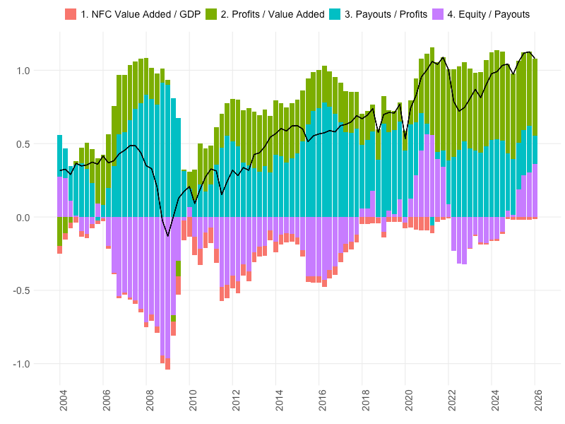
Yes, both profits and payouts are high relative to their long-run averages; but those shifts mostly came earlier, while the big rise in equity prices is more recent.  Apart from the relatively brief collapse in profits during the Great Recession, almost all the variation in equity prices over the past two decades comes from the valuation term, rather than changes in the underlying payments to shareholders.

This is even more true over the past two years — equity values have increased sharply while profits have been stable and aggregate payments to shareholders have fallen, as dividend growth has stalled and net equity issue has turned positive.  As a share of GDP, the net payments flowing from corporations to shareholders today are very close to where they were a decade ago; but corporate equity is worth 60 percent more. It’s hard to avoid the conclusion that either equity was undervalued in the mid-2010s, or it is overvalued now. 

So which side do we focus on? Over the long run, most — tho not all — of the increase in the value of wealth in the form of corporate equity, is explained by what we might call fundamentals — the flow of payments to owners of that wealth. Over the short to medium run, on the other hand, almost all of the increase in the value of equity comes from valuation, and whatever financial-market dynamics drive that. Or as the old saying goes, in the short run the market is a voting machine, but in the long run it’s a weighing machine.

*

I want to say a bit more about the profits and payouts parts of the picture.

That high stock prices reflect to some extent a high level of corporate profits seems to be reasonably well understood, at least based on recent coverage in the Financial Times. This of course does not mean that high stock prices are justified, or sustainable; it just shifts the question to how justified or sustainable the high profits are.

This goes double to the extent that high valuations are based on an expectation of further increases in profits, as this recent FT piece suggests:

Wall Street’s expectations for company profit growth are rising at the fastest pace since the post-pandemic rebound, fuelling concern that an “earnings bubble” could be forming in the estimates that have underpinned the US stock market’s rally.

Analysts are now forecasting a 25 per cent increase in S&P 500 company earnings for the coming year, according to Bloomberg data, boosted by a resilient US economy and the AI boom.

However, just ahead of the second-quarter earnings season, some investors are growing concerned about the speed at which analysts’ estimates are rising…

This Alphaville piece goes further, saying that “supernormal profits are unsustainable, because they always are.” I don’t know about that. I don’t know if there’s any reason to think the profit share is stationary, to use the statistics jargon — apart from a dip in 2008-2009, profits as a share of value added have been greater than their long-run average in every year of this century, and seem to be getting farther from it. Capital really has won some lasting victories in the class war.

That is one natural way to look at profits — as a distributional variable. But there’s another way of looking at them, from the demand side.

We know, as readers of Keynes, that an increase in investment automatically creates an equal quantity of additional saving. If, furthermore, there’s little or no incremental saving out of wage income (a reasonable assumption, in my opinion) and if the fiscal balance and trade balance don’t change significantly (perhaps less reasonable,  but we’ll go with it) then this additional saving must take the form of an increase in profits. This relationship is often known as the Kalecki-Levy profits identity, and is one bit of heterodox economics that has established a foothold in finance and the business press. The same identity says that an increase in the fiscal deficit or trade surplus should similarly lead to an equal increase in aggregate profits.

Exploring the math of this and the extent to which it is a reasonable first approximation of real-world dynamics would be an interesting exercise for another post. But it raises another point which I think is very relevant for thinking about the current situation: Even if the AI companies themselves are not particularly (or at all) profitable, AI-related investment spending is probably an important factor in raising aggregate profits. Just like the California gold rush generated plenty of profits for somebody, even if the vast majority of prospectors themselves went broke.

Or as this recent FT piece puts it:

The AI boom is lifting the fortunes of hundreds of formerly drab industrial, utility and mining companies as investors turn to the “picks and shovels” needed to build and power vast data centres. …

The companies benefiting include Caterpillar, best known for construction equipment but now supplying generators for data centres, 150-year-old German engineering company Hochtief, which will enter the Dax later this month, and Nucor, a steel supplier that has credited “white hot” AI demand for a “tsunami of earnings power”. …

The vast amounts of electricity needed for AI training are also fuelling demand for specialised power management, high-voltage electronics and cooling technologies. This has led to big interest in traditional suppliers of electrical equipment…

You could think of it like this: As long as there is strong investment demand and easy financing for it, the profits will be there …. but not necessarily for the companies carrying out the investment and getting the financing.

And this, perhaps, is the point where the macro perspective needs to give way to the micro one. Because it may be that, yes, in the aggregate, an ease in financing brings forth additional investment, which generates enough profits to justify the initial financing. But debt must be paid back not in the aggregate, but by the specific companies that incurred it. If the investment is one place and the profits are somewhere else, then at some point somebody’s survival constraint is going to be violated.

And I think I will end this post here.

I very much want to discuss the payouts piece of the equation, which in my mind is as important as profits, and much less discussed. But this post is already too long, and has taken much too long to write. So the payouts piece should be along, well, if not this month, then next month, or soon.

Corporate cashflows, 1960-2016

Here is some background on the investment question from the previous post, and related topics.

I’ve been fooling around recently with assembling a comprehensive account of sources and uses of funds for the US corporate sector from the Integrated Macroeconomic Accounts (IMA). (It’s much easier to do this with the IMAs than by combining the NIPAs with the financial accounts from the Fed.) The goal is a comprehensive account of flows of money into and out of the corporate sector, grouped in a sensible way.

My goal here is not to make any specific argument, but to provide context for a bunch of different arguments about the finances of US businesses. I think this an important thing to do – both mainstream and heterodox people tend to make claims about specific sets of flows in specific periods, but it’s important to start from the overall picture. Otherwise you don’t know what questions it makes sense to ask. It’s also important to give a complete set of flows, for the same reasons and also to check that one’s claims are logically coherent. Needless to say, you also have to measure everything consistently.

Some people do do this, of course — the social accounting matrices of Lance Taylor and company are the best versions I know of. But it’s relatively rare.

The IMAs are a fairly new set of national accounts, motivated by two goals. First, to combine the “real” flows tracked by the BEA with the financial flows and balance-sheet positions tracked by the Fed into a single, consistent set of accounts; and second, to produce a set of US accounts that conform to the System of National Accounts (SNA) followed by most of the rest of the world. (The SNAs are sort of the metric system of national accounts.) The first goal is more completely realized than the second – there are some important differences between the IMAs and SNAs. For our purposes, the most important one is the definition of the corporate sector.  In the SNAs corporate businesses include, broadly, any enterprise staffed mainly by wage workers that produces goods and services for sale; this includes closely-held firms, government-owned enterprises, and many nonprofits. In the IMAs, the corporate sector is based on tax status, and so excludes partnerships and small family businesses, nonprofits, and government enterprises.

The nonfinancial corporate sector on the IMA definition accounts for roughly 50 percent of US value-added. [1] I think there are good reasons to focus on this 50 percent. This is where most important productive activity takes place, and where essentially all the profit that economic life is organized around is generated. It’s also the sector where the conceptual categories of economics best correspond to observables. We don’t directly see output in public sector or nonprofits, don’t directly see wages and profits in noncorporate sector, we don’t see either in the household sector. Finance of course has its own issues.

In any case! Figure 1 shows the corporate sector’s share of value added since 1960.

Figure 1


I am not sure what substantive significance, if any, most of the movements in this figure have. Some large part, perhaps most, of them reflect definitional or measurement factors rather than any change in concrete economic activity. That said, the secular rise in finance as well as government does, I think, reflect changes in what people do all day. The only one of these lines that definitely means what it seems, is the long-run rise in government – given the way the accounts are constructed, there must be a corresponding rise in the share of public sector employment. The household sector line basically reflects changes in the weight of spending associated with owner-occupied housing – the nonprofit piece of this is fairly stable over time. The fall and rise in the noncorporate business sector may also reflect the changing weight of real estate – where noncorporate forms are common – and independent-contractor arrangements. But it may also reflect shifts in legal forms and/or BEA imputations, that don’t involve any substantive change in productive activity.

Nonetheless this figure is important — less for what it tells us about economic substance than for what it tells us about economic data. Any series that exclusively or disproportionately draws from the corporate sector (nonresidential investment is an obvious and important case) will be scaled by that top line. And any discussion of factor shares needs to take into account the change in the shares of sectors where wages and/or profits are not directly observed.

Figure 2 is the real point of this post. It’s my broadest summary of sources and uses of funds in the corporate sector. All are measured as a share of total corporate value added. The same data is shown in the table at the end.

Figure 2


I’ve organized this in a somewhat nonstandard way, but which I think is appropriate for the questions we are most interested in. The vertical scale is fraction of corporate value-added, or output. The heavy black line shows the share of output available to corporate managers. Above the line are three deductions from value-added: first, wages and other compensation of labor; second, in gray, taxes, including both taxes on production and corporate income taxes; and third, the narrow white band, net payments to the financial system. This last is interest and other property payments, less interest, dividends and other property payments received. These are the three categories of payments that are effectively imposed on corporations from outside. [2] The area below this line is the internal funds at the disposal of management – what’s often referred to as corporate cashflow.

In red are two main uses of funds by corporate managers. The bottom red area is investment. Above this is payouts — first dividends, and then the top red area, net share repurchases. This latter includes both repurchases in the strict sense and shares retired through cash mergers and acquisitions – aggregate data combines them. The difference between the black line and the red line is net financial saving by the corporate sector. Where the heavy black line is above the top red line, the corporate sector is a net lender in financial markets – its acquisitions of financial assets are greater than the new debt it is incurring. Where the red line is above the black line, as it usually is, the corporate sector is a net borrower – its new debt is greater than its acquisition of financial assets.

Finally, the dotted black line shows reported depreciation. (Consumption of fixed capital in the jargon of the accounts.) This is not actually a source or use of funds. And there are serious conceptual and measurement issues with defining it – so much so that, in my view, it’s probably not a usable category for describing real world economies. Nonetheless, it is necessary to define some other terms that play a big part in these discussions. Most importantly, profits can be regarded as the difference between cashflow and depreciation. [3] And net investment is the difference between investment and depreciation.

The same items are presented in the table at the end of the post, for three periods and for the most recent full year available.

As I discuss below, some terms are grouped here differently from the way they are presented in the IMAs. Obviously, how exactly we aggregate is open to debate, and the pros and cons of different choices will depend on the questions we are trying to answer. But I think some picture like this has to be the starting point for any kind of historical discussion of the US economy.

So what do we see?

First, the labor share (i.e. labor costs as a percent of value added) is quite stable around 63-64 percent of value added between 1960 and 2000. It only begins falling in 2002 or so, dropping about 4 points in the early 2000s and another 3 points in the wake of the Great Recession, with a modest recovery in the past couple years. This timing is quite different from the impression most people have — what you’d get from straightforwardly looking at the wage share of GDP — of a steady long-term decline from the 1970s.

There are two reasons for this difference. First, during the 1970s and 1980s, the non-wage share of labor costs (mainly health benefits) rose quite a bit, from around 5 percent to around 10 percent of total compensation. This explains why labor cost growth did not slow during this period, even though wage growth did slow. Since healthcare prices were rising quite a bit faster than overall prices during this period, the rising share of health benefits in compensation also meant that the cost of labor to employers was also rising faster than the value of compensation to workers. [4] This factor becomes less important after the early 1990s, when the non-wage share of labor compensation flatted out.

Second, the labor share in the corporate sector is quite a bit higher than the labor share in finance and noncorporate businesses — the two sectors whose share of GDP has increased in recent decades. This means that even if there were no change in factor shares within each sector, the labor share for the economy as a whole would fall. Again, I don’t know how much of the difference in factor shares between sectors is a measurement issue, how much it reflects shifting legal forms of organization of the same kinds of activities, and how much it reflects real differences in how claims on the social product are exercised. But either way, it’s important to understand that a large part of the observed fall in the labor share over the past generation is explained, at least in an accounting sense, by this shift between sectors.

Moving on to taxes, there is also a substantial fall in this claim on corporate value-added, from 16 percent in 1960 to around 11 percent today.  But here, the decrease comes earlier, in the 1960s and 1970s – the tax share has hardly changed since 1980. (I suspect that if this figure were extended to earlier dates, there would be a large fall in the tax share in the 1950s as well.) This means that after-tax profits show a more steady long-term rise than do pre-tax profits.

I should note that “taxes” here combines two items from the IMAs — taxes on production, and taxes on profits. In the national accounts, there are good reasons to separate these — taxes on production enter into the cost of output and so have to be treated as a factor payment, while taxes on profits are not part of costs and so are treated as a transfer. This distinction is critical if we are going to calculate GDP in a consistent way, but for substantive questions it’s not so important. To government, managers and other economic actors, taxes are all mandatory payments from the corporation to the state, however they are assessed.

After taxes comes net financial payments. As defined here, this is interest, rent and net current transfers, less interest, rent and dividends received. In other words, it is net payments on the corporate sector’s existing financial assets and liabilities.  It’s represented on the figure by the white space between the thin black line and the thick black line. The first thing to notice about these net payments by corporations is that they are almost always positive and never significantly negative. In other words, over the past 56 years the corporate sector as a whole has never received more income from its financial assets than it has paid on its financial liabilities. You can see that the largest share of corporate value-added going to financial payments came in the high-interest 1980s; in most other periods the balance has been close to zero.

I’ll come back to this in a later post – a next step in this project should be precisely to unpack that white section. But the fact that the net financial income of the corporate sector is small, never positive, and shows no significant trend over time, is already enough to reject one popular story about financialization, at least in its most straightforward form. It is simply not the case that nonfinancial corporations in the aggregate have turned themselves into hedge funds – have replaced profits from operations with income from financial assets. The Greta Krippner article that seems to be  the most influential version of this claim is a perfect example of the dangers of focusing on one piece of the cashflow picture in isolation. [5] She looks at financial income received by corporations but ignores financial payments made by corporations (mostly interest in both cases). So as shown in Figure 3, she mistakes a general rise in interest rates for a change in the activities of nonfinancial businesses.

Figure 3. Because she focuses on the heavy black segment in isolation, Krippner mistakes a period of high interest rates for a reorientation of nonfinancial corporations to financial profits.


Returning to Figure 2: After subtracting labor costs, taxes and interest and other financial claims, we are left with the heavy red line — the share of value added available as cashflow to corporate managers. This rises from 20 percent in the 1960s to as high as 25 percent in the 1990s, to around 30 percent today. This increase in the corporate profit share (gross of depreciation, net of taxes) is one of the central facts of modern US macroeconomic history.

In the broadest terms, corporations can use cashflow in three ways. They can invest it in order to maintain or grow the business; they can distribute it to shareholders; or they can retain it for later use in some financial form. This last use can be, and often is, negative, if investment and payouts are together greater than cashflow.

Investment here includes gross capital formation, defined in the national accounts as spending on durable equipment, structures, software, research and development, and the creation of intellectual property. (The last two items have been included in the national-accounts measure of investment only since 2013.) It also includes the change in private inventories and spending on nonproduced durable assets, which I assume is almost all land. This item is listed separately in the IMAs, and it’s not obvious how to handle it: Corporate purchases of land have different macroeconomic implications than spending on new means of production, but from the point of view of the people making the investment decision there’s no major difference between money spent on a building and money spent for the land it sits on. This item is generally very small — well below 1 percent of total investment — but, like inventories, it’s highly cyclical and so plays a disproportionate role in short-run fluctuations. About a tenth of the fall in investment between 2008 and 2010, for example, was in nonproduced assets.

Somewhat surprisingly, there is no downward trend in the investment share. It was 17 percent of value added in the 1960s and 1970s, versus over 18 percent in this decade, and 19 percent in the third quarter of 2017 (the most recent available).

If investment today is, if anything, historically high as a share of corporate output, why have so many people (including me!) been arguing that weak investment is a problem? There are several reasons, though perhaps none are entirely convincing.

First, as I pointed out in the previous post, in recent years there has been an unusual divergence between investment in the corporate sector and investment in the economy as a whole. Residential investment by households remains very low by historical standards; nonresidential investment by noncorporate businesses is also low. At the same time, financial and especially noncoporate businesses always invest at lower rates than nonfinancial corporations, so the rising share of these sectors leads to lower overall investment. Second, the recovery in corporate investment is relatively recent – things looked different a few years ago. Nonfinancial corporations’ investment share fell extremely sharply in 2009, to its lowest level in 45 years, and took several years to bounce back. So when we were discussing this stuff three or four years ago, the picture looked more like a secular decline. Third — and probably most relevant for my work — while investment is relatively high as a share of corporate value added, it is quite low as a share of profits or cashflow. There is a genuine puzzle of weak investment, as long as we don’t ask “why are corporations investing less?”, but instead ask “why haven’t high profits led corporations to invest more?” Fourth, there has been a large increase in reported depreciation — from around 10 percent of value added in the 1960s to around 15 percent today. While I think for a number of reasons that this number is not really meaningful, if you take it seriously, it means that while gross investment has risen slightly, net investment has fallen a lot, to about half its level in the 1960s and 70s. Finally, if you take a strong Keynesian or Kaleckian view that it’s business investment that drives shifts in demand, then the ratios shown here are not informative about the strength or weakness of investment. The ratio of investment to output, in this view, only tells us about the size of the multiplier. To assess the strength or weakness of investment, we should instead look at the absolute increase in investment over the business cycle, which — while it’s picked up a bit in the past year — is still quite low by historical standards. I’ve made this argument myself, but I wouldn’t want to push it too far — investment is not the only source of autonomous demand.

Moving on in Figure 2: Above investment is payouts – first dividends, then net share repurchases. Here we see what you’d expect: These flows have gone up a lot. Dividends have doubled from 4.5 percent of value added in the 1960s and 1970s to 9 percent today, while net repurchases have gone from less than nothing to 6 percent (and as high as 10 percent in the 2000s.) Measured as a share of corporate cashflow rather than value added, dividends have remained stable at around 50 percent. Retained earnings as conventionally defined — profits minus dividends — have also been roughly stable as a share of value added.

Including net share repurchases with dividends is the biggest way my presentation here departs from the format of the IMAs. There, net share issuance is classed as an addition to liabilities, just like issuance of new debt. Net repurchases are the same as negative issuance — the equivalent, in the IMA framework, of paying back loans. The difference, of course, is that share repurchases have no effect on the balance sheet. This is the fundamental reason I think it makes sense to group repurchases with dividends. The flow of dividend payments is not affected by the number of shares outstanding. [6] It’s also important that market participants clearly perceive share repurchases as equivalent to dividend payments. If you read the financial press, dividends and buybacks are always treated as two forms of shareholder payouts.

Personally, I don’t have any doubts that this is the right way to look at it — today. But this is a good example of how the relations between economic and accounting categories are always somewhat slippery and can change over time. Whether net share issuance should be classed with dividends (and interest payments, etc.) as a current transfer, as I do, or whether it should be considered a financing transaction, where the standard IMA presentation puts it, depends on the way these transactions are actually used – it can’t be answered a priori. Again, I think it’s reasonably clear that, given their use today, net stock repurchases should be grouped with dividends. But in the 1950s or 1960s, treating them as financing made more sense. Also, this adjustment needs to be made consistently. If we are going to count repurchases as dividends, we have to subtract them from the headline measures of retained earnings and corporate saving. We will probably want to make an equivalent adjustment to the accounts of other sectors as well, though this poses its own set of challenges.

Another thing to consider is that we see negative issuance not only when corporations repurchase their own shares, but when shares are purchased for cash as part of mergers and acquisitions. This is not necessarily a problem. If we are just adding up payments for the sector as a whole, the two sets of flows are equivalent. On a more concrete behavioral or policy level there are important differences, but we’ll pass over those for now.

If we look at dividends alone, 2016 saw them at their highest share of corporate value-added, of profits and of cashflow since the IMAs begin in 1960; and almost certainly since the 1920s. If we measure payouts as dividends plus net share repurchases, then 2016 levels were still a bit short of the peak in the mid-2000s. Share repurchases have been a bit lower (around 5 percent of value added) in 2017 than 2016; unfortunately, the quarterly IMAs don’t have dividend data, but the financial accounts suggest that dividends have declined somewhat as well. It seems that the 2-point decline in the profit share since its 2014 peak is now beginning to be reflected in payouts to shareholders. By comparison with any period before the mid-2000s, payouts are still very high. Still, their decline over the past year seems significant – though maybe the tax bill will give them a second wind.

The final item in Figure 2 is the space between the heavy red line and heavy black line. This shows the financing gap – the net financial borrowing (if positive, with the red line above the black line) or lending (if negative) by the corporate sector. In my opinion this is a much more relevant number than corporate saving as conventionally defined. As the figure shows, nonfinancial corporations are normally net borrowers in financial markets; the brief periods of net lending are all associated with deep recessions. As the figure also makes clear, however, this specific interpretation is quite sensitive to counting share repurchases as payouts. If net equity issuance is treated as a form of financing, then the aggregate corporate sector has been mostly close to a zero balance in financial markets and has more recently been a substantial net lender. On the other hand, if we think of this gap as showing the net credit-market borrowing by the nonfinancial corporate sector — as it more or less is — then the conclusion holds regardless of how you treat stock buybacks. Either way, by this measure the recent expansion is not exceptional: As of 2016 credit-market borrowing by the corporate sector was still smaller, as a share of value-added, than it was at the high points of the 1980s, 1990s or 2000s.

The same results are shown below for three periods and for the most recent year. I won’t recap the table, it’s the same stories as above. Just to be clear, the values are the averages for the periods shown for the flows listed in the second column. So for instance labor costs accounted for an average of 63 percent of corporate value-added during 1960-1979. The first column just shows the accounting relationships between the flows.

Flow 1960-1979 1980-1999 2000-2015 2016
100 – (A) Labor costs 63 64 60 59
(B) Taxes 15 12 12 12
(C) Net financial payments 1 2 1 1
= (D) Internal funds (cashflow) 21 22 27 29
(E) Dividends 5 5 7 9
+ (F) Net share repurchases -1 2 4 6
= (G) Payouts 4 7 11 15
(H) Investment 17 18 18 18
(J) Depreciation 10 13 15 15
= (K) Net investment 7 5 4 3
(G) + (H) – (D) = (I) Financing gap 0 3 2 5
(D) – (J) = (L) Profits 11 9 13 14

What do we take from all this? Again, my goal here was not to make any particular substantive claim, but to lay out some essential context for more specific arguments about corporate finances that I’ll make in the future. But it is interesting, isn’t it?


[1] Value-added is the difference between sales and the cost of material inputs. It’s the best way to measure the output of various sectors. For the economy as a whole, total value-added is identically equal to GDP.

[2] Of course corporations have some control over their wage, tax and debt-service payments. But these are not mainly decision variables for corporate management in the same way that investment and shareholder payouts are. Or at least I think it’s reasonable to so regard them.

[3] Whether they are exactly this value or only approximately depends on the profits concept being used. In any case, it’s important to keep in mind that the values of depreciation used by corporations for reporting profits to financial markets and to the tax authorities, may be quite different from the depreciation reported in the national accounts.

[4] The different behavior of prices of workers’ consumption basket and of output in general was the subject of the first substantive post on this blog, seven years ago. It’s an important topic!

[5] While I don’t agree with the claims in this article, I’m a big admirer of Krippner’s other work.

[6] The big exceptions, of course, are cases that involve all of a given corporation’s shares — IPOs and transactions that take a company private. These do respectively create and extinguish dividend flows. For this reason, when using micro data, it may make sense to use gross rather than net repurchases; but this isn’t possible with the IMA data. IPOs however are a quite small part of the overall net issuance/repurchase of shares, and I am pretty sure that firms going private are as well. Private equity might create some more serious issues here — this is something I’d like to understand better. On the other hand, the advantage of using net rather than gross repurchases is that it eliminates repurchases that are simply compensating for stock issued as part of compensation packages.