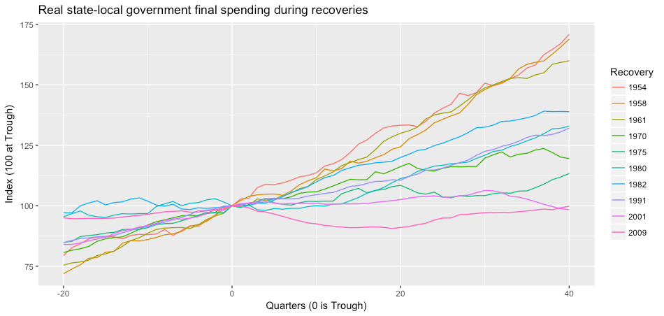
Brian Nichols of the essential Employ America has a useful, if depressing, roundup of the coming wave of state-local austerity. Some highlights: Ohio, Nevada and Pennsylvania have already announced hiring freezes; Ohio is also looking at a 20 percent across the board cut in state spending, while Virginia has canceled planned raises for teachers. Many cities, including New York, St. Paul and New Orleans, are laying off public employees. And as I noted in my last post, New YorkState is planning to slash $400 million from the hospitals at the front line of the crisis.
This isn’t new. One of the many drawbacks of American federalism is that state and local government spending — which includes the great majority of public sevices that people use on a day to day basis — is distinctly procyclical. Following the 2007-008 crisis, austerity at the state and local level more than offset stimulus at the federal level. And it lasted much longer than the recession itself.
In fact, as my colleague Amanda Page-Hoongrajok points out, inflation-adjusted state and local final expenditure did not return to its 2009 level until 2019.1 On a per-capita basis, real state and local final expenditure is 5 percent lower today than it was at the bottom of the last recession.
As we face the rising wave of public-service cutbacks, we need to be fighting on all levels. We need to demand a massive package of aid to state and local govrnments as part of Stimulus IV. We need to be pushing the Fed to do more to support municipal finances. We need to keep the pressure up on mayors and governors not to throw their hands up and wait for the feds, but to be creative in working around their fiscal constraints.2 And also, we need to keep in mind: As far as state and local spending is concerned, the Great Recession never ended.
The action is on the asset side. Arjun Jayadev, Amanda Page-Hoongrajok and I have a new version of our state-local balance sheets paper up at Washington Center for Equitable Growth. It’s moderately improved from the version posted here a few months ago. I’ll have a blogpost up in the next day or two laying out the arguments in more detail. In the meantime, here’s the abstract:
This paper … makes two related arguments about the historical evolution of state-local debt ratios over the past 60 years. First, there is no consistent relationship between state and local budget deficits and changes in state and local government debt ratios. In particular, the 1980s saw a shift in state and local budgets toward surplus but nonetheless saw rising debt ratios. This rise in debt is fully explained by a faster pace of asset accumulation as a result of increased pressure to prefund future expenses… Second, budget imbalances at the state level are almost entirely accommodated on the asset side – both in the aggregate and cross-sectionally, larger state-local deficits are mainly associated with reduced net asset accumulation rather than with greater credit-market borrowing. …
What recovery? One of the central questions of U.S. macroeconomic policy right now is whether the slow growth of output and employment over the past decade are the result of supply-side factors like demographics and an exhaustion of new technologies, or whether — despite low measured unemployment — we are still well short of potential output. Later this month, I’ll have a paper out from the Roosevelt Institute making the case for the latter — that there is still substantial space for more expansionary policy. Some of my argument is anticipated by this post from Simon Wren-Lewis, which briefly lays out several ways in which a demand shortfall can have lasting effects on the economy’s productive capacity — discouraged workers leaving the labor force; reduced investment by business; and slower technical progress, because a slack economy is less favorable for innovation. He concludes: “There is no absence of ideas about how a great recession and a slow recovery could have lasting effects. If there is a problem, it is more that this simple conceptualization” — textbook model in which demand has only short-run effects — “has too great a grip on the way many people think.”
Along the same lines, here is a nice post from Adam Ozimek on the “mystery” of low wage growth. The mystery is that despite low unemployment, annual wage growth (as measured by the Employment Costs Index) has remained relatively low – 2 to 2.5 percent, rather than the 3 to 3.5 percent we’d expect based on historical patterns. (Ozimek doesn’t mention it, but total compensation growth — including benefits — is even lower, less than one percent for the year ending March 2017.) But, he points out, this historical relationship is based on measured unemployment; if we use the employment-population ratio instead, then recent wage gains are exactly where you’d expect historically. So the behavior of wages is another piece of evidence that the official unemployment rate is underestimating the degree of labor market slack, and that the fall in the employment-population ratio reflects — at least in part — weak demand rather than the inevitable result of worse demographics (or better video games).
The bondholders’ view of the world. Matthew Klein has a very enjoyable post at FT Alphaville taking apart the claim (from three prominent academics) that “The French Revolution began with the bankruptcy of the ancient regime.” This is, of course, supposed to illustrate the broader dangers of allowing sovereigns to stiff bondholders. But in fact, as Klein points out, the old regime did not default on in its loans — Louis XVI went to great lengths to avoid bankruptcy, precisely because he was afraid of the reaction of creditors. Further: It was the monarchy’s efforts to avoid default — highly unpopular taxes and spending cuts, then the calling of the Estates General to legitimate them — that set in motion the events that led to the Revolution. So the actual history — in which a government was overthrown after choosing austerity over bankruptcy — has been reversed 180 degrees to fit the prevailing myth of our times: that good and bad political outcomes all depend on the grace of the bond markets. As Klein says, this might seem like a small mistake, but it is deeply revealing about how ideology operates: “ Whoever introduced it must have been working off what he thought was common knowledge that didn’t need to be checked. There is no citation.”
Klein’s piece is also, in passing, a nice response to that silly Jacob Levy post which argues that democracy and popular sovereignty are myths and that modern states have always been ruled by the bondholders. Levy offers zero evidence for this claim; his post is of interest only as a signpost for where elite discourse may be heading.
Don’t blame Germany. Here is a very useful paper from Enno Schroeder and Oliver Piceck estimating the effects of an increase in German demand on other European economies. They use an input-output model to estimate the effect of an increase in spending in Germany on output and employment in each of the other 10 largest euro-area countries. One of the things I really like about this is that it does not depend on either econometrics or on any kind of optimization; rather, it is simply based on the observable data of the distribution of consumption spending and of intermediate inputs by various industries over different industries and countries, along with the fraction of household income consumed in various countries. This lets them answer the question: If spending in Germany increased by a certain amount and the composition of spending otherwise remained unchanged, what would the effect be on total spending in various European countries? Yes, they ignore possible price changes; but I don’t think it’s any less reasonable than the conventional approach, which goes to the opposite extreme and assumes prices are everything. And even if you want to add a price story, this approach gives you a useful baseline to build on.
Methodology aside, their results are interesting and a bit surprising: They find that the spillovers from Germany to other European countries are surprisingly small.
Our main finding suggests that if Germany’s final demand were to exogenously increase by one percent of GDP, then France, Italy, Spain, and Portugal’s GDP would grow by around a 0.1 percent, their unemployment rates would be reduced by a bit over 0.1 points, and their trade balances would improve by approximately 0.04 points. The spillover effects on Greece are significantly smaller.
Given how much larger Germany is than most of these countries, and how tightly integrated European economies are understood to be, these are surprisingly small numbers. It seems that a large proportion of German demand still falls on domestic goods, while imports come largely from the euro area — particularly, in the case of intermediate goods, from the former Warsaw Pact countries. As a result, even
if a German demand boom were to materialize, France, Greece, Italy, Spain, and Portugal would not benefit much in terms of growth and external adjustment. The real beneficiaries would be small neighbors (e.g. Austria and Luxembourg) and emerging economies in Eastern Europe that are well integrated into German supply chains (e.g. Czech Republic and Poland).
Of course, this doesn’t mean that more expansionary policy in Germany isn’t desirable for other reasons. (For one thing, German workers badly need raises.) But for the balance of payments problems in Southern Europe, other solutions are needed.
Today’s conventional is yesterday’s unconventional, and vice versa. Here is a useful NBER paper from Mark Carlson and Burcu Duygan-Bump on the conduct of monetary policy in the 1920s. As they point out, much of today’s “unconventional” policy apparatus was standard at that point, including large purchases of a range of securities — quantitative easing avant le lettre. As I’ve written on this blog before (here and here and here) discussion of monetary policy is made needlessly confusing by economists’ habit of treating the policy instrument as having a direct, immediate link to macroeconomic outcomes, which can be derived from first principles. Whereas anyone who reads even a little history of central banking finds that the ultimate goal of control over the pace of credit expansion has been pursued by a wide range of instruments and intermediate targets in different settings.
Also on the mechanics of monetary policy, I liked these twoposts from the New York Fed’s Liberty Street Economics blog. They do something which should be standard but isn’t — walk through step by step the balance sheet changes associated with various central bank policy shifts. In my experience, teaching monetary policy in terms of balance sheet changes is much more straightforward than with the supply-and-demand diagrams that are the basic analytic tool in most textbooks. The curves at best are metaphors; the balance sheets tell you what actually happens.
The first paper, which I presented in January in Chicago, is a critical assessment of the idea of a close link between income distribution and household debt. The idea is that rising debt is the result of rising inequality as lower-income households borrowed to maintain rising consumption standards in the face of stagnant incomes; this debt-financed consumption was critical to supporting aggregate demand in the period before 2008. This story is often associated with Ragnuram Rajan and Mian and Sufi but is also widely embraced on the left; it’s become almost conventional wisdom among Post Keynesian and Marxist economists. In my paper, I suggest some reasons for skepticism. First, there is not necessarily a close link between rising aggregate debt ratios and higher borrowing, and even less with higher consumption. Debt ratios depend on nominal income growth and interest payments as well as new borrowing, and debt mainly finances asset ownership, not current consumption. Second, aggregate consumption spending has not, contrary to common perceptions, risen as a share of GDP; it’s essentially flat since 1980. The apparent rise in the consumption share is entirely due to the combination of higher imputed noncash expenditure, such as owners’ equivalent rent; and third party health care spending (mostly Medicare). Both of these expenditure flows are treated as household consumption in the national accounts. But neither involves cash outlays by households, so they cannot affect household balance sheets. Third, household debt is concentrated near the top of the income distribution, not the bottom. Debt-income ratios peak between the 85th and 90th percentiles, with very low ratios in the lower half of the distribution. Most household debt is owed by the top 20 percent by income. Finally, most studies of consumption inequality find that it has risen hand-in-hand with income inequality; it appears that stagnant incomes for most households have simply meant stagnant living standards. To the extent demand has been sustained by “excess” consumption, it was more likely by the top 5 percent.
The paper as written is too polemical. I need to make the tone more neutral, tentative, exploratory. But I think the points here are important and have not been sufficiently grappled with by almost anyone claiming a strong link between debt and distribution.
The second paper is on state and local debt – I’ve blogged a bit about it here in the past few months. The paper uses budget and balance sheet data from the census of governments to make two main points. First, rising state and local government debt does not imply state and local government budget deficits. higher debt does not imply higher deficits: Debt ratios can also rise either because nominal income growth slows, or because governments are accumulating assets more rapidly. For the state and local sector as a whole, both these latter factors explain more of the rise in debt ratios than does the fiscal balance. (For variation in debt ratios across state governments, nominal income growth is not important, but asset accumulation is.) Second, despite balanced budget requirements, state and local governments do show substantial variation in fiscal balances, with the sector as a whole showing deficits and surpluses up to almost one percent of GDP. But unlike the federal government, the state and local governments accommodate fiscal imbalances entirely by varying the pace of asset accumulation. Credit-market borrowing does not seem to play any role — either in the aggregate or in individual states — in bridging gaps between current expenditure and revenue.
I will try to blog some more about both these papers in the coming days. Needless to say, comments are very welcome.
Here is a figure from the paper I’m presenting at the Eastern Economics Association meetings next weekend, on state and local government balance sheets:
State Government Finances 1999-2013. Source: Census of Governments, author’s analysis
This figure is just for aggregate state governments. It shows total borrowing (red), net acquisition of financial assets (blue), and the overall fiscal balance (black, with surplus as positive). It also shows the year over year change in the ratio of state debt to GDP (the gray dotted line). A number of interesting points come out here:
Despite statutory balanced-budget requirements, state budgets do show significant cyclical movement, from aggregate deficits of around 0.5 percent of GDP in recent recessions to surpluses as high as 0.5 percent of GDP in the expansions of the 1980s and 1990s (not shown here). Individual state governments show larger movements.
Shifts in state government fiscal balances are accommodated almost entirely on the asset side of the balance sheet. When state government revenue exceeds current expenditure, they buy financial assets; when revenue falls or expenditure rises, they sell financial assets (or buy less). State governments borrow in order to finance specific capital projects; unlike the federal government, they do not use credit-market borrowing to close gaps between current expenditure and revenue. (As I show in the paper, this is still true when we look at state governments cross-sectionally rather than aggregate data.) Between 2005 and 2009, state budgets moved from an aggregate surplus of around 0.3 percent of GDP to an aggregate deficit of around 0.5 percent. But borrowing over this period was completely flat – the entire shortfall was made up by reduced acquisition of financial assets.
The ratio of state government debt to GDP rose over the Great Recession period, by a total of about 2 points. While this is small compared with the increase in federal debt over the same period, it is certainly not trivial. Among other things, rising state debt ratios have been used as arguments for austerity and attacks on pubic-sector unions in a number of states. But as we see here, the entire rise in state debt-GDP ratios over this period is explained by slower growth. The ratio rose because of a smaller denominator, not a bigger numerator.
State debt ratios rose around the same time that state budgets moved into deficit. But there is no direct relationship between these two developments. Deficits were financed entirely through a reduction in assets. Simultaneously, the drastic slowdown in growth mean that even though state governments significantly reduced their borrowing, in dollar terms, during the recession, the ratio of debt to income rose. It is true, of course, that both the deficits and the growth slowdown were the result of the recession. But the increase in state debt ratios would have been exactly the same if state budgets had not moved to deficit at all.
Since 2010 there has been a simultaneous fall in state government borrowing and acquisition of assets. When these two variables vary together (as they also do across governments in some periods) it suggests that there is some autonomous balance sheet adjustment going on that can’t be reduced to the net financial position changing to accommodate real flows. (The fact that offsetting financial positions cannot in general be netted out is one of the main planks of Bezemer’s accounting view of economics.)
The pattern is similar in the previous recession. Although there was some increase in borrowing as state governments moved into deficit in 2002-2003, the large majority of the financing was on the asset side.
The larger significance of all this, and the data underlying it, is discussed more in the paper. I will post that here next week. In the meantime, the two big takeaways are, first, that a lot of historical variation in debt ratios are driven by the effect of different nominal growth rates on the existing debt stock rather than by new borrowing; and that state governments don’t finance budget imbalances on the liability side of their balance sheets, but on the asset side.
(Earlier posts based on the same work here and here.)
Minimum wages are good for poor people. Here is an important paper from Arin Dube on the impact of minimum wage increases on family income. Using a variety of approaches, he asks what the record of minimum wage changes tells us about how the effects of the minimum at different points in the income distribution. The core finding is that, in his preferred specification, the elasticity of income at the 10th percentile with respect to the minimum wage is around 0.4 – that is, a one percent increase in the minimum wage will raise income for poor families by close to half a percent. This is, to my mind, a really big number – it suggests that pay at most low-wage jobs is tightly linked to the minimum wage, and that criticism of minimum wages as being badly targeted at low income households is off the mark. Tho to be fair, he also finds that minimum wage increases don’t do much for the very bottom of the distribution, where there is not much wage income to begin with. But beyond whatever this ammo this gives for minimum wage supporters, this is a great example of how you should approach this kind of question as a social scientist. The paper gets out of the box of qualitative debates about job loss that have dominated this debate and makes a positive, quantitative claim about what minimum wages actually do.
This is the effect of a doubling of the state minimum wage on family income, per Dube.
Why prefund? I’m still trying to finish this interminable paper on state and local government balance sheets. But one of the big things I’ve learned is that the biggest constraint these governments face is not the terms on which they can borrow, but the extent to which they are required to prefund future expenses. The idea that pensions should be fully funded has a solid basis for private employers but it’s not at all clear that the same arguments apply for governments. It’s good to see that some professionals in state and local finance have come to the same conclusion. Here is a new paper from the Haas Institute on exactly this question. It makes a strong case that the requirement to fully fund public employee pensions is costly and unnecessary, and is an important factor in local government budget crises.
Unlike other aspects of American hegemony, the dollar has grown more important as the world has globalised, not less. … As economies opened their capital markets in the 1980s and 1990s, global capital flows surged. Yet most governments sought exchange-rate stability amid the sloshing tides of money. They managed their exchange rates using massive piles of foreign-exchange reserves … Global reserves have grown from under $1trn in the 1980s to more than $10trn today.
Dollar-denominated assets account for much of those reserves. Governments worry more about big swings in the dollar than in other currencies; trade is often conducted in dollar terms; and firms and governments owe roughly $10trn in dollar-denominated debt. … the dollar is, on some measures, more central to the global system now than it was immediately after the second world war. …
America wields enormous financial power as a result. It can wreak havoc by withholding supplies of dollars in a crisis. When the Federal Reserve tweaks monetary policy, the effects ripple across the global economy. Hélène Rey of the London Business School argues that, despite their reserve holdings, many economies have lost full control over their domestic monetary policy, because of the effect of Fed policy on global appetite for risk.
… During the heyday of Bretton Woods, Valéry Giscard d’Estaing, a French finance minister (later president), complained about the “exorbitant privilege” enjoyed by the issuer of the world’s reserve currency. America’s return on its foreign assets is markedly higher than the return foreign investors earn on their American assets… That flow of investment income allows America to run persistent current-account deficits—to buy more than it produces year after year, decade after decade.
Exactly right. You can have free capital mobility, or you can have a balanced trade for the US. But you can’t have both, as long as the world depends on dollar reserves.
Greece: still a catastrophe. Over at Alphaville, Matthew Klein makes a strong case that Greece’s experience in the euro has been uniquely catastrophic – no modern balance of payments crisis elsewhere has led to anything like as large and as sustained a fall in output and employment. Martin Sandbu objects, arguing that the Greek catastrophe is the result of austerity, not of the single currency per se. Which is true, but also, it seems to me, misses the point. The problem with the euro — as Klein more or less says — isn’t mainly that it precludes devaluation, but that it surrenders authority over the basic tools of macroeconomic policy to a foreign authority — an authority, as it turns out, that has been happy to see Greece burn pour encourager les autres.
The myth of capital strike. I was more on Team Streeck than Team Tooze in their great LRB showdown. But this followup post by Tooze is very smart. Mostly he’s just trying to bring some much-needed order to a complicated set of debates about the role of private finance, credit markets, central banks and the state. But he also scores, I think, a stronger point against Streeck than in the LRB review: Streeck exaggerates the threat of capital strike in modern “managed-money” economies. As Tooze says:
Greece, Spain, Portugal, Ireland even Italy and France all experienced bond market attacks. But this is because they were left by the ECB in a situation which was as though they had borrowed their entire sovereign debt in a foreign currency with no central bank support. … That peculiarity is the result of deliberate political construction. To generalize and reify it into a general theory of capitalist democracy in crisis is highly misleading.
I think Tooze is right: behind the apparent power of the bondholders there’s always either a hostile central bank, or else other, stronger countries.
Things are speeding up here at the end. From Credit Suisse, here is an interesting discussion of longevity of firms in the S&P 500.
There is a general sense that the rate of change is accelerating and that corporate longevity is shrinking. This assertion appears frequently in the business press. Our research shows a more nuanced picture. Indeed, a common measure of corporate longevity, turnover of the companies in the S&P 500, shows that longevity has lengthened in recent years.
A hell of a way to run a railroad. For New Yorkers who are bored of the things they are mad about and want something new to be mad about: The Port Authority capital plan approved this week includes $1.5 billion for Cuomo’s pointless LaGuardia AirTrain. Of course it would be too much to ask that we extend the existing transit system, we have to create a special new system for airport travelers only. But Cuomo’s plan is useless even for them.
Strikes: still declining. Various people have been sharing a graph of strikes “involving 1000 or more workers” on Facebook. I expressed some doubts about this – it’s obviously true that the US has seen a drastic decline in strikes and in worker militance in general, but how well is this captured by a series that only includes the largest strikes? Andrew Bossie replies, showing that for the earlier period where we have more comprehensive strike data, it matches the 1000+ series pretty well. Fair enough.
Welfare is not only for whites. Here is a useful corrective from Matt Bruenig to claims that the welfare state disproportionately serves white Americans. I assume the idea behind these arguments is to disarm claim that welfare is just for “them.” But the politics could cut other way – it’s equally easy to see “welfare goes to whites” as a move to advance the idea that racial justice and economic justice are unrelated, even conflicting, goals. Anyway, whatever it rhetorical uses, we still need a clear and honest assessment of how things work. Which Matt as usual provides.
TPP is dead … or is it? My collaborator Arjun Jayadev has a nice piece in The Hindu (circulation 1.4 million, not far off the New York Times) on the legacy of the late, unlamented Trans-Pacific Partnership. It can be hard to rememebr, amid the shrieks and shudders and foul smells coming from the Oval Office, how destructive and, in its own way, insane, was the pre-Trump liberal consensus for free trade and endless war.
Just give people nice things is a sound basis for policy. “When we decided peoples’ houses shouldn’t burn down, we didn’t provide savings accounts for private fire insurance, we hired firefighters and built fire stations. If the broad left takes power again, enough with too-clever-by-half social engineering. Help people and take credit.”
In a previous post, I pointed out that state and local governments in the US have large asset positions — 33 percent of GDP in total, down from nearly 40 percent before the recession. This is close to double state and local debt, which totals 17 percent of GDP. Among other things, this means that a discussion of public balance sheets that looks only at debt is missing at least half the picture.
On the other hand, a bit over half of those assets are in pension funds. Some people would argue that it’s misleading to attribute those holdings to the sponsoring governments, or that if you do you should also include the present value of future pension benefits as a liability. I’m not sure; I think there are interesting questions here.
But there are also interesting questions that don’t depend on how you treat the existing stocks of pension assets and liabilities. Here are a couple. First, how how do changes in state credit-market debt break down between the current fiscal balance and other factors, including pension fund contributions? And second, how much of state and local fiscal imbalances are financed by borrowing, and how much by changes in the asset position?
Most economists faced with questions like these would answer them by running a regression. [1] But as I mentioned in the previous post, I don’t think a regression is the right tool for this job. (If you don’t care about the methods and just want to hear the results, you can skip the next several paragraphs, all the way down to “So what do we find?”)
Think about it: what is a regression doing? Basically, we have a variable a that we think is influenced by some others: b, c, d … Our observations of whatever social process we’re interested in consist of sets of values for a, b, c, d… , all of them different each time. A regression, fundamentally, is an imaginary experiment where we adjusted the value of just one of b, c, d… and observed how a changed as a result. That’s the meaning of the coefficients that are the main outputs of a regression, along with some measure of our confidence in them.
But in the case of state budgets we already know the coefficients! If you increase state spending by one dollar, holding all other variables constant, well then, you increase state debt by one dollar. If you increase revenue by one dollar, again holding everything else constant, you reduce debt by one dollar. Budgets are governed by accounting identities, which means we know all the coefficients — they are one or negative one as the case may be. What we are interested in is not the coefficients in a hypothetical “data generating process” that produces changes in state debt (or whatever). What we’re interested in is how much of the observed historical variation in the variable of interest is explained by the variation in each of the other variables. I’m always puzzled when I see people regressing the change in debt on expenditure and reporting a coefficient — what did they think they were going to find?
For the question we’re interested in, I think the right tool is a covariance matrix. (Covariance is the basic measure of the variation that is shared between two variables.) Here we are taking advantage of the fact that covariance is linear: cov(x, y + z) = cov(x, y) + cov(x, z). Variance, meanwhile, is just a variable’s covariance with itself. So if we know that a = b + c + d, then we know that the variance of a is equal to the sum of its covariances with each of the others. In other words, if y = Σ xn then:
(1) var(y) = Σ cov(y, xn)
So for example: If the budget balance is defined as revenue – spending, then the variance of some observed budget balances must be equal to the covariance of the balance with revenue, minus the covariance of the balance with spending.
This makes a covariance matrix an obvious tool to use when we want to allocate the observed variation in a variable among various known causes. But for whatever reason, economists turn to variance decompositions only in few specific contexts. It’s common, for instance, to see a variance decomposition of this kind used to distinguish between-group from within-group inequality in a discussion of income distribution. But the same approach can be used any time we have a set of variables linked by accounting identities (or other known relationships) and we want to assess their relative importance in explaining some concrete variation.
In the case of state and local budgets, we can start with the identity that sources of funds = uses of funds. (Of course this is true of any economic unit.) Breaking things up a bit more, we can write:
revenues + borrowing = expenditure + net acquisition of financial assets (NAFA).
Since we are interested in borrowing, we rearrange this to:
But we are not simply interested in borrowing,w e are interested in the change in the debt-GDP ratio (or debt-GSP ratio, in the case of individual states.) And this has a denominator as well as a numerator. So we write:
(3) change in debt ratio = net borrowing – nominal growth rate
This is also an accounting identity, but not an exact one; it’s a linear approximation of the true relationship, which is nonlinear. But with annual debt and income growth rates in the single digits, the approximation is very close.
So we have:
(4) change in debt ratio = expenditure – revenue + NAFA – nominal growth rate * current debt ratio
It follows from equation (1) that the variance of change in the debt ratio is equal to the sum of the covariances of the change with each of the right-side variables. In other words, if we are interested in understanding why debt-GDP ratios have risen in some years and fallen in others, it’s straightforward to decompose this variation into the contributions of variation in each of the other variables. There’s no reason to do a regression here. [2]
So what do we find?
Here’s the covariance matrix for combined state and local debt for 1955 to 2013. “Growth contrib.” refers to the last term in Equation (4). To make reading the table easier, I’ve reversed the sign of the growth contribution, fiscal balance and revenue; that means that positive values in the table all refer to factors that increase the variance of debt-ratio growth and negative values are factors that reduce it. [3]
Debt Ratio Growth
Growth Contrib.
Fiscal Balance
Revenue
Expenditure
NAFA & Trusts
Debt Ratio Growth
0.18
Growth Contrib. (-)
0.10
0.11
Fiscal Balance (-)
0.03
0.04
0.13
Revenue (-)
0.08
0.24
0.12
5.98
Expenditure
0.11
0.28
-0.01
5.86
5.87
NAFA & Trusts
0.06
-0.05
0.13
-0.01
-0.14
0.23
How do we read this? First of all, note the bolded terms along the main diagonal — those are the covariance of each variable with itself, that is, its variance. It is a measure of how much individual observations of this variable differ from each other. The off-diagonal terms, then, show how much of this variation is shared between two variables. Again, we know that if one variable is the sum of several others, then its variance will be the sum of its covariances with each of the others.
So for example, total variance of debt ratio growth is 0.18. (That means that the debt ratio growth in a given year is, on average, about 0.4 percentage points above or below the average growth rate for the full period.) The covariance of debt-ratio growth and (negative) growth contribution is 0.10. So a bit over half the debt-ratio variance is attributable to nominal GDP growth. In other words, if we are looking at why the debt-GDP ratio rises more in some years than in others, more of the variation is going to be explained by the denominator of the ratio than the numerator. Next, we see that the covariance of debt growth with the (negative) fiscal balance is 0.03. In other words, about one-sixth of the variation in annual debt ratio growth is explained by fiscal deficits or surpluses.
This is important, because most discussions of state and local debt implicitly assume that all change in the debt ratio is explained this way. But in fact, while the fiscal balance does play some role in changes in the debt ratio — the covariance is greater than zero — it’s a distinctly secondary role. Finally, the last variable, “NAFA & Trusts,” explains about a third of variation in debt ratio growth. In other words, years when state and local government debt is rising more rapidly relative to GDP, are also years in which those governments are adding more rapidly to their holdings of financial assets. And this source of variation explains about twice as much of the historical pattern of debt ratio changes, as the fiscal balance does.
Since this is probably still a bit confusing, the next table presents the same information in a hopefully clearer way. Here see only the covariances with debt ratio growth — the first column of the previous table — and they are normalized by the variance of debt ratio growth. Again, I’ve flipped the sign of variables that reduce debt-ratio growth. So each value of the table shows the share of variation in the growth of state-local growth ratios that is explained by that component. There is also a second column, showing the same thing for state governments only.
Component
State + Local
State Only
Nominal Growth (-)
0.52
0.30
Fiscal Balance (-)
0.17
0.31
Revenue (-)
-0.41
0.07
Expenditure
0.58
0.24
… of which: Interest
0.06
0.03
Trust Contrib. and NAFA
0.33
0.37
… of which: Pensions
0.01
0.02
I’ve added a couple variables here — interest payments under expenditure and pension contributions under NAFA and Trusts. Note in particular the small value of the latter. Pension contributions are quite stable from year to year. (The standard deviation of state/local pension contributions as a percent of GDP is just 0.07, versus around 0.5 for nontrust NAFA.) This says that even though most state and local assets are in pension funds, pension contributions contribute only a little to the variation in asset acquisition. Most of the year to year variability is in governments’ acquisition of assets on their own behalf. This is helpful: It means that if we are interested in understanding variation in the growth of debt over time, or the role of assets vs. liabilities in accommodating fiscal imbalances, we don’t need to worry too much about how to think about pension funds. (If we want to focus on the total increase in state debt, as opposed to the variation over time, then pensions are still very important.)
If we compare the overall state-local sector with state governments only, the picture is broadly similar, but there are some interesting differences. First of all, nominal growth rates are somewhat less important, and the fiscal balance more important, for state government debt ratio. This isn’t surprising. State governments have more flexibility than local ones to independently adjust their spending and revenue; and state debt ratios are lower, so the effect on the ratio from a given change in growth rates is proportionately smaller. For the same reason, the effect of interest rate changes on the debt ratio, while small in both cases, is even smaller for the lower-debt state governments. [4]
So now we have shown more rigorously what we suggested in the previous post: While the fiscal balance plays some role in explaining why state and local debt ratios rise at some times and fall at others, it is not the main factor. Nominal growth rates and asset acquisition both play larger roles.
Let’s turn to the next question: How do state and local government balance sheets adjust to fiscal imbalances? Again, this is just a re-presentation of the data in the first table, this time focusing on the third column/row. Again, we’re also doing the decomposition for states in isolation, and adding a couple more items — in this case, the taxes and intergovernmental assistance components of revenue, and the pension contribution component of NAFA. The values are normalized here by the variance of the fiscal balance. The first four lines sum to 1, as do the last three. In effect, the first four rows of the table tells us where fiscal imbalances come from; the final three tell us where they go.
Component
State + Local
State Only
Revenue, of which:
0.94
1.01
… Taxes
0.50
0.93
… Intergovernmental
0.18
-0.04
Expenditure (-)
0.06
-0.01
Trust Contrib. and NAFA, of which:
1.04
0.92
… Pensions
0.10
-0.49
Borrowing (-)
-0.04
0.08
So what do we see? Looking at the first set of lines, we see that state-local fiscal imbalances are entirely expenditure-driven. Surprisingly, revenues are no lower in deficit years than in surplus ones. Note that this is true of total revenues, but not of taxes. Deficit years are indeed associated with lower tax revenue and surplus years with higher taxes, as we would expect. (That’s what the positive values in the “taxes” row mean.) But this is fully offset by the opposite variation in payments from the federal government, which are lower in surplus years and higher in deficit years. During the most recent recession, for example, aggregate state and local taxes declined by about 0.4 percent of GDP. But federal assistance to state and local governments increased by 0.9 percent of GDP. This was unexpected to me: I had expected most of the variation in state budget balances to come from the revenue side. But evidently it doesn’t. The covariance matrix is confirming, and quantifying, what you can see in the figure below: Deficit years for the state-local sector are associated with peaks in spending, not troughs in revenue.
Aggregate State-Local Revenue and Expenditure, 1953-2013
Turning to the question of how imbalances are accommodated, we find a similarly one-sided story. None of the changes in state-local budget balances result in changes in borrowing; all of them go to changes in fund contributions and direct asset purchases. [5] For the sector as a whole, in fact, asset purchases absorb more than all the variation in fiscal imbalances; borrowing is lower in deficit years than in surplus years. (For state governments, borrowing does absorb about ten percent of variation in the fiscal balance.) Note that very little of this is accounted for by pensions — less than none in the case of state governments, which see lower overall asset accumulation but higher pension fund contributions in deficit years. Again, even though pension funds account for most state-local assets, they account for very little of the year to year variation in asset purchases.
So the data tells a very clear story: Variation in state-local budget balances is driven entirely by the expenditure side; cyclical changes in their own revenue are entirely offset by changes in federal aid. And state budget imbalances are accommodated entirely by changes in the rate at which governments buy or sell assets. Over the postwar period, the state-local government sector has not used borrowing to smooth over imbalances between revenue and spending.
[1] The interesting historical meta-question, to which I have no idea of the answer, when and why regression analysis came to so completely dominate empirical work in economics. I suspect there are some deep reasons why economists are more attracted to methodologies that treat observed data as a sample or “draw” from a universal set of rules, rather than methodologies that focus on the observed data as the object of inquiry in itself.
[2] I confess I only realized recently that variance decompositions can be used this way. In retrospect, we should have done this in our papers in household debt.
[3] Revenue and expenditure here include everything except trust fund income and payments. In other words, unlike in the previous post, I am following the standard practice of treating state and local budgets separate from pension funds and other trust funds. The last line, “NAFA and Trusts”, includes both contributions to trust funds and acquisition of financial assets by the local government itself. But income generated by trust fund assets, and employee contributions to pension funds, are not included in revenue, and benefits paid are not included in expenditure. So the “fiscal balance” term here is basically the same as that reported by the NIPAs and other standard sources.
[4] This is different from households and the federal government, where higher debt and, in the case of households, more variable interest rates, mean that interest rates are of first-order importance in explaining the evolution of debt ratios over time.
[5] It might seem contradictory to say that a third of the variation in changes in the debt ratio is due to the fiscal balance, even though none of the variation in the fiscal balance is passed through to changes in borrowing. The reason this is possible is that those periods when there are both deficits and higher borrowing, also are periods of slower nominal income growth. This implies additional variance in debt growth, which is attributed to both growth and the fiscal balance. There’s some helpful discussion here.
(This post is based on a paper in process. I probably will not post any more material from this project for the next month or so, since I need to return to the question of potential output.)
Let’s talk about state and local government balance sheets.
Like most sectors of the US economy, state and local governments have seen a long-term increase in credit-market debt, from about 8 percent of GDP in 1950 to 19 percent of GDP in 2010, before falling back a bit to 17 percent in 2013. [1] While this is modest compared with federal-government and household debt, it is not trivial. Municipal bonds are important assets in financial markets. On the liability side, state and local debt operates as a political constraint at the state level and often plays a prominent role in public discussions of state budgets. Cuts to state services and public employee wages and pensions are often justified by the problem of public debt, municipal bond offerings are a focal point for local politics, and you don’t have to look far to find scare stories about an approaching state or local debt crisis.
State and Local Government Debt, 1953-2013
My interest in state and local debt is an extension of my work (with Arjun Jayadev) on household debt and on sovereign debt. The question is: To what extent to historical changes in debt ratios reflect the balance between revenue and expenditure, and to what extent do they represent monetary-financial factors like inflation and interest rates? The exact balance of course depends on the sector and period; what we want to steer people away from is the habit of assuming that balance sheet changes are a straightforward record of real income and spending flows. [2]
The first thing to note about state and local debt is that, as the first figure shows, only about 40 percent of it is owed by state governments, with the majority is owed by the thousands of local governments of various types. Of the 10 percent of GDP or so owed by local governments, about half is owed by general-purpose governments (cities, counties and towns, in that order), and half by special purpose districts, with school districts accounting for about half of this (or a bit over 2 percent of GDP). This is interesting because, as the figure below shows, the majority of state and local spending is at the state level.
State and Local Government Spending, 1953-2013
This imbalance goes back to at least the 1950s and 1960s, when local governments accounted for just over half of combined state and local spending, but more than three-quarters of combined state and local government debt. The explanation for the different distributions of spending and debt over different levels of government is simple: While state governments account for a larger share of total state and local spending, local governments account for about two-thirds of state and local capital spending. In the US, most infrastructure spending is the responsibility of local governments; direct service provision, which requires buildings and other fixed assets, is also disproportionately local. State government budgets, on the other hand, include a large proportion of transfer spending, which is negligible at the local level. Since debt is mainly used to finance capital spending, it’s no surprise that the distribution of debt looks more like the distribution of capital spending than like the distribution of spending in general.
This is an interesting fact in itself, but it also is a good illustration of an important larger point that should be obvious but is often ignored: The main use of debt is to finance assets. This simple point is for some reason almost always ignored by economists — both mainstream and heterodox economists regard the paradigmatic loan as a consumption loan. [3] Among other things, this leads to the mistaken idea that credit-market debt reflects — or at least is somehow related to — dissaving. When in fact there’s no connection.
For households and businesses, just as for state and local governments, the majority of debt finances investment. [4] This means that additions to the liability side of the balance sheet are normally simultaneous with additions to the asset side, with no effect on saving. If anything, since most assets are not financed entirely with debt, most transactions that increase debt require saving to increase also. (Homebuyers normally get a mortgage and make a downpayment.) Sovereign governments are the only economic units whose borrowing mainly finances gaps between current revenue and current expenditure. Again, this point is missed as much by heterodoxy as by the mainstream. Just flipping over to the next tab in my browser, I find a Marxist writing that “Debt has become so high that the personal savings rate in the United States actually became negative.” Which is a non sequitur.
The fact that most state-local debt is at the local level, while most spending is at the state level, is a reflection of the fact that debt is used to finance capital spending and not spending in general. But in and of itself this fact doesn’t tell us anything about how much changes in the state-local debt ratio reflect fiscal deficits or dissaving. It still could be true that state and local debt mainly reflects accumulated fiscal deficits.
As it turns out, though, it isn’t true at all. As the next figure shows, historically there is no relationship between changes in the state-local debt ratio and the state-local fiscal balance.
Here, the vertical axis shows the change in the ratio of aggregate state and local debt to GDP over the year. The horizontal axis shows the aggregate fiscal balance, with surpluses positive and deficits negative. So for instance, in 2009 the debt ratio increased by about one point, while state and local governments ran an aggregate budget deficit of close to 6 percent of GDP. [5] If changes in the debt ratio mainly reflected fiscal deficits, we would expect most of the points to fall along a line sloping down from upper left to lower right. They really don’t. Yes, 2009 has both very large deficits and a large rise in the debt ratio; but 2007 has the largest aggregate surpluses, and the debt ratio rose by almost as much. Eyeballing the figure you might see a weak negative relationship; but in this case your eyeballs are fooling you. In fact, the correlation is positive. A regression of the change in on debt on the fiscal balance yields a coefficient of positive 0.11, significant at the 5 percent level. As I’ll discuss later, I’m not sure a regression is a good tool for this job. But it is good enough to answer the question, “Is state and local debt mainly the result of past deficits?” with a definite No.
How can state and local fiscal balances vary without changing the sector’s debt? The key thing to recognize about state and local government balance sheets is that they also have large financial asset positions. In the aggregate, the sector’s net financial wealth is positive; unlike the federal government, state and local governments are net creditors, not net borrowers, in financial markets. As of 2013, the sector as a whole had total debt of 18 percent of GDP, and financial assets of 34 percent of GDP. As the following figures show, the long-term rise in state and local assets is much bigger than the rise in debt. Now it is true that most of these assets are held in pension funds, rather than directly. But a lot of them are not. In fact, for state governments — though not for the state-local sector as a whole — even nontrust assets exceed total debt. And whether or not you want to attribute pension assets to the sponsoring government, contributions to pension funds are important margin on which state budgets adjust.
State and Local Financial Assets, 1953-2013
Combined State-Local Financial Net Wealth
As the final figure shows, since the mid 1990s the aggregate financial assets of state-local government have exceeded aggregate debt in every single state. (Alaska, with government net financial wealth in excess of 100 percent of gross state product, is off the top of the chart, as is Wyoming.) This is a change from the 1950s and 1960s, when positive and negative net positions were about equally common. Nationally, the net credit position of state and local governments was equal to 16 percent of GDP in 2013, down from over 20 percent in 2007.
These large asset positions have a number of important implications:
1. To the extent that state and local governments run deficits in recessions, they are can be financed by reducing net acquisition of assets rather than by issuing more debt. And historically it seems that this is how they mostly are financed, especially in recent cycles. So if we are interested in whether state and local budgets behave procyclically or anticyclically, the degree of flexibility these governments have on the asset side is going to be a key factor.
2. Some large part of the long-term increase in state and local debt can be attributed to increased net acquisition of assets. This is especially notable in the 1980s, when there were simultaneous rises in both state debt and state financial assets. And changes in assets are strongly correlated across states. I.e. the states that increase their debt the most in a given year, tend to also be the ones that increased their assets the most — in some periods, higher debt is actually associated with a shift toward a net creditor position.
3. Low interest rates are not so clear an argument for increased infrastructure spending as people often assume, given that little of this spending currently happens at the federal level. Yes, an individual project may still look more cost-effective, but set against that is the pressure to increase trust fund contributions.
4. If state and local governments face financial constraints on current spending, these are at least as likely to reflect the terms on which they must prefund future expenses as the terms on which they can borrow.
The second point is the key one for my larger argument. Debt is part of a financial system that evolves independently of the system comprising “real” income and expenditure. They connect with each other, but they don’t correspond to each other. The case of state and local governments is somewhat different from households and the federal government — for the latter two, changes in interest rates play a major role in the evolution of debt ratios (along with changing default rates for households), while net acquisition of financial assets is not important for the federal government. But in all cases, purely financial factors play a major role in the evolution of debt ratios, along with changes in nominal income growth rates, which explain about a third of the variation in state-local debt ratios over time. And in all cases the divergence between the real and financial variables is especially visible in the 1980s.
With respect to state and local governments specifically, point 4 may be the most interesting one. Why do state and local governments hold so much bigger asset positions than they used to? What is the argument for prefunding pension benefits and similar future expenses, rather than meeting them on a pay-as-you-go basis? And how do those arguments change if we think the current regime of low interest rates is likely to persist indefinitely? It’s not obvious to me that either public employees or public employers are better off with funded pensions. Unlike in the private sector, public employees don’t need insurance against outliving their employer. It’s not obvious why governments should hold reserves against future pension payments but not against other equally large, equally predictable future payments. Nor is it obvious how much protection funded pensions offer against benefit cuts. And if interest rates remain lower than growth rates, prefunding pensions is actually more expensive than treating them as a current expense. I see lots of discussion about how state and local government funds should be managed, but does anyone ask whether they should hold these big funds at all?
In any case, given the very large asset positions of state and local governments, and the large cyclical and secular variation in net acquisition of assets, it’s clear that we shouldn’t imagine there’s any connection between sate and local debt and state and local fiscal positions. And we shouldn’t assume that the main financial problem faced by state and local governments is the terms they can borrow on. Most of the action is on the asset side.
[2] All data in this post comes from the Census of Governments.
[3] This is true of economic theory obviously, but it’s also true of a lot of empirical work. When Gabriel Chodorow-Reich was hired at Harvard a few years ago, for instance, his job market paper was an empirical study of credit constraints on business borrowers that ignored investment and treated credit as an input into current production.
[4] For households, nearly 70 percent of debt is accounted for by mortgages, with auto loans and student debt accounting for another 10 percent each. (Admittedly, spending in the latter two categories is counted as consumption the national accounts; but functionally, cars and diplomas are assets.) Less than 10 percent of household debt looks like consumption loans.
[5] This is different from the number you will find in the national accounts. The main reasons for the difference are, first, that the Census works on a strict cashflow basis, and, second, that it consolidates pension and other trust funds with the sponsoring government. (See here.) This means that if a pension fund’s benefit payments exceed its income in a given year, that contributes to the deficit of the sponsoring government in the Census data, but not in the national accounts. This is what’s responsible for the very large deficits reported for 2009. If we are interested in credit-market debt the Census approach seems preferable, but there are some tricky questions for sure. All this will be discussed in more detail in the paper I’m writing on state and local balance sheets.